Farrow And Ball Cromarty
If you’re looking for a beautiful, light green gray paint color, be sure to consider Farrow and Ball Cromarty! Cromarty No.285 is a lovely and subtle green paint that is considered a crowd-favorite, and one of Farrow and Ball’s most versatile greens!

Cromarty by Farrow and Ball is a popular shade of green that will add a beautiful, subtle, and calming color to your home. It would look so pretty painted on an interior doors, bedroom walls or paneling, or even exterior shutters.
This is a versatile and muted gray green paint color that looks beautiful in both daylight and lightly dimmed rooms. If you’re considering a grey green paint color, here is everything you need to know about Farrow and Ball Cromarty.

Love it already? Get an overnight peel-and-stick sample of Cromarty sent straight to your door via DesignShop HERE!
Why You’ll Love Farrow And Ball Cromarty No.285
If you love neutral paint colors but still want to embrace a bit of subtle color, a mid tone, muted gray green is a fantastic option. The key is to first find the right shade of gray green (and don’t assume a description of “green gray” reads gray… it may very well read more green!). A beautiful soft green paint that looks great on both interior walls in different lighting, on furniture or DIY projects, on trim, and on exterior doors or shutters, that doesn’t read too gray: welcome, Cromarty!
Farrow and Ball states this about Cromarty: “This very light green grey is named after the Cromarty Firth estuary, a place of swirling mists mentioned daily in the Shipping Forecast. A neutral yet atmospheric colour, Cromarty brings a muted softness to any room, creating an easy to use finish that is neither too green nor too grey.”
And I couldn’t agree more with the color description. Cromarty is a muted, soft, calming green-gray paint that looks especially beautiful on interior walls of a bedroom, living room, or nursery. It has a soft and neutral hue that feels relaxing and grounding.
Here are some reasons why you’ll love Farrow And Ball’s Cromarty:
- Beautiful muted gray-green color
- Lovely and versatile light shade of green, that can often act as a neutral
- Feels calming and grounding
- Great paint color for furniture and other DIY projects (and F&B paint is even considered “toy-safe”!)
- Goes well with many other paint colors, especially neutrals, creamy whites, and other shades of green
- Looks great on trim or molding
- Pairs well with many wallpaper options
- Quality exterior and interior paint
- Comes in a variety of finishes
We’ll touch more on these details here…

Farrow and Ball Cromarty LRV
F&B Cromarty has an LRV of approximately 60.
What is LRV? LRV refers to Light Reflectance Value.
LRV is a useful factor to consider when choosing an interior paint color. It’s a numerical way of measuring how much visible light a surface reflects. Essentially, it’s used to figure out the lightness and brightness of a specific paint color.

Here’s a quick breakdown of LRV:
- Scale: LRV ranges from 0 to 100
- Higher LRV: Indicates a lighter color that reflects more light, making a space feel brighter
- Lower LRV: Indicates a darker color that absorbs more light, creating a dimmer atmosphere
- 0%: Pure Black: Absorbs all light, appearing completely dark
- 100%: Pure White: Reflects all light, appearing very bright
- LRV helps you understand how much a specific paint color will brighten or darken a room
- Choosing LRV:
- Large rooms with lots of natural light: Can handle darker colors (lower LRV) for a dramatic effect
- Smaller rooms or those with limited natural light: Often benefit from lighter colors (higher LRV) to maximize brightness
However, take this with a grain of salt, because sometimes you may really want a small room, like a powder room, or an intimate room, like a study, to feel a bit dark and moody!
**NOTE: LRV helps to understand how much a specific paint color will brighten or darken a room, but in order to truly get a feel for how a color will look in a room it’s always recommended use a paint sample in the room and look at it in different lighting throughout the day!
Is Farrow and Ball Cromarty A Warm Or Cool Color?
Because of its green undertone, Cromarty is a warm color. While described as a “green gray”, it really reads more green than gray. So you could think of it as a “warm gray with green undertones” in technicality, but it really is more of a soft, neutral, light green. (Paint colors can be tricky like that!). Cromarty has a very misty, calming, warm, and cozy feel to it- you’ll love it!
However, it’s important to note that undertones can be subtle and can also be influenced by various factors such as lighting and surrounding colors.
Cromarty, like many other favorite green paint colors, can look quite different depending on the light and time of day. So again, be sure to always test out a sample or large swatch in your desired room!

Below, you can see how Cromarty almost “changes” color depending on the surrounding colors that influence it. Cromarty is pictured here on the left side of each image (all Farrow and Ball green paint colors), and can look quite different paired with other shades of green.
Image 1 shows Cromarty vs Mizzle– here it pulls more of a subtle neutral vs Mizzle which reads more of a saturated green
Image 2 shows Cromarty vs French Gray– although both are considered a “green gray”, Cromarty is much lighter in comparison to French Gray
Image 3 shows Cromarty vs Vert De Terre– Cromarty looks lovely paired with Vert De Terre, and you can see how Vert De Terre also pulls more of a soft green, whereas Cromarty on the left is much more delicate in tone
Image 4 shows Cromarty vs Lichen– here you can really see the “mossy” color of Lichen on the right, where Cromarty on the left feels even more subtle green/neutral
Although the color can change depending on lighting and surrounding colors, Cromarty is SUCH a pretty, soft and versatile green.


Farrow and Ball Cromarty Ideas
Front Door– A Farrow and Ball Cromarty front door would look so pretty, calm, and welcoming!
Walls– A calming soft green color like Cromarty would look fantastic in a room that feels cozy and intimate like a bedroom, living room, bathroom, or nursery!
This Cromarty dining room is absolutely stunning:
What a perfect reading corner surrounded by lovely Cromarty painted walls:
Trim, Molding, & Wainscoting– Even if you don’t paint an entire wall, Cromarty-painted trim, molding, or wainscoting/paneling would look beautiful. This cozy bedroom features Cromarty painted paneling:
And this cozy office nook has the most beautiful Cromarty painted paneling:
Kitchen Cabinets– This beautiful Cromarty kitchen features painted lower cabinets (paired with BM Swiss Coffee upper cabinets):
Painted Furniture– This color would look great painted on a variety of furniture pieces. Consider painting nightstands, a bookcase, hutch, dresser or even a bathroom vanity. Cromarty is such a versatile color that looks beautiful painted on furniture and can often act as a neutral due to its muted shade of green.
These bedroom wardrobes are painted in Cromarty and it’s such a calming shade of green:
DIY Projects– If you don’t want to commit to painting a large room, consider smaller DIY projects such as painted picture frames, a kids play kitchen makeover, a potting bench, or even a wooden bird feeder in Cromarty.
With Wallpaper– F & B Lichen looks fantastic paired with a neutral wallpaper
*Keep reading for some gorgeous wallpaper pairing ideas down below!

What Colors Go With Cromarty?
Whether you’re looking for accent colors or trim colors that pair with F & B Cromarty, these are some paint colors that look beautiful together:
- Creamy Whites or Crisp, Soft Whites
- Benjamin Moore White Dove
- Farrow and Ball Wimborne White
- Farrow and Ball Slipper Satin
- Benjamin Moore Swiss Coffee
- Benjamin Moore Simply White
- Farrow and Ball Pointing
- Sherwin Williams Alabaster
- Benjamin Moore Crisp Linen
- Benjamin Moore Chantilly Lace
- Soft Taupe Colors
- Farrow and Ball Bone
- Farrow and Ball Off-White
- Farrow and Ball School House White
- Farrow and Ball Stony Ground
- Benjamin Moore Edgecomb Gray
- Farrow and Ball Shadow White
- Farrow and Ball Shaded White
- Benjamin Moore Classic Gray


- Light Blues
- Farrow and Ball Parma Gray
- Farrow and Ball Lulworth Blue
- Farrow and Ball Kittiwake
- Benjamin Moore Pale Smoke
- Benjamin Moore French Toile
- Soft Pinks
- Farrow and Ball Pink Ground
- Farrow and Ball Calamine
- Farrow and Ball Middleton Pink
- Farrow and Ball Tailor Tack
- Benjamin Moore Touch of Pink
- Farrow and Ball Setting Plaster
- Deep Blues & Blue-Gray Hues
- Farrow and Ball Stiffkey Blue
- Farrow and Ball Oval Room Blue
- Farrow and Ball De Nimes
- Farrow and Ball Selvedge
- Farrow and Ball Inchyra Blue
- Farrow and Ball Hague Blue
- Greens
- Farrow and Ball Vert De Terre
- Farrow and Ball Calke Green
- Farrow and Ball Card Room Green
- Farrow and Ball Green Smoke
- Farrow and Ball Mizzle
- Farrow and Ball French Gray
- Farrow and Ball Treron
- Farrow and Ball Blue Gray (reads a soft green)
- Farrow and Ball Pigeon
Ready to Paint?
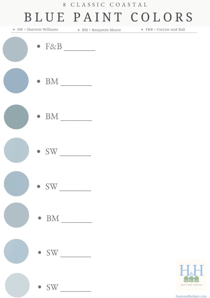
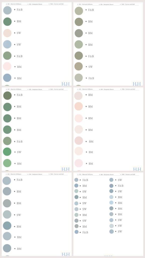
Get My Best-Selling Paint Color Guides!
From gorgeous coastal blues to beautiful grandmillennial greens, from preppy pinks to muted earthy greens, these classic paint colors are the tried and true go-to’s of some of your favorite interior designers!
What Wallpaper Goes With Farrow and Ball Cromarty?

There are SO many gorgeous wallpaper options that go well with Cromarty No.285.
Neutral wallpaper would look gorgeous paired with Cromarty! Neutral colors like cream, taupe, and white are a safe bet for wallpaper that pairs well with a muted gray green paint. (*BE SURE TO CHECK OUT THIS SUPER POPULAR LIST OF THE MOST BEAUTIFUL NEUTRAL WALLPAPER!)
Neutral prints or textured grasscloth pair beautifully:


Green wallpaper would also look stunning paired with this lovely green paint! Green and white wallpaper would look really nice paired with F&B’s Cromarty painted wainscoting, paneling or trim. (*BE SURE TO READ THIS SUPER POPULAR LIST OF THE MOST BEAUTIFUL GREEN WALLPAPER!)
I love this pairing for a green boys bedroom:

And this pairing feels a bit coastal and calm all in one:

Soft pink wallpaper would look darling in a girls bedroom or baby girl nursery paired with Cromarty trim or wainscoting.

Floral or Tree wallpaper would not only look lovely paired with Cromarty, it would add a lovely garden, forest or nature-inspired feel to the room, like with this stunning Sanderson wallpaper and Cromarty pairing below:


Toile wallpaper would also look lovely coordinated with this muted green.
Blue and White wallpaper would look stunning with Farrow and Ball Cromarty. The combination of pretty light blue, soft green, and white is gorgeous. (*BE SURE TO CHECK OUT THIS SUPER POPULAR LIST OF THE MOST BEAUTIFUL BLUE AND WHITE WALLPAPER!)
How pretty is this pairing for a blue and green girls bedroom or nursery:

The misty green gray hue looks so calming when paired with this pretty light blue and white wallpaper below:

Here’s a more saturated blue and white wallpaper option, where Farrow & Ball Cromarty plays more of a green gray neutral- remember, you can always choose to have a Cromarty-painted piece of furniture to pair with a gorgeous wallpaper in the background!

What Finishes Are Available For Farrow And Ball Cromarty No.285?
Cromarty comes in many different paint finishes for both interior walls, interior surfaces and exterior surfaces.
- Dead Flat: 2% sheen
- Modern Emulsion: 7% sheen
- Estate Emulsion: 2% sheen
- Modern Eggshell: 40% sheen
- Estate Eggshell: 20% sheen
- Full Gloss: 95% sheen
- Exterior Eggshell: 20% sheen
- Exterior Masonry: 2% sheen
*You can order a sample pot HERE from Farrow and Ball (*All sample pots & swatches come in F&B’s classic Estate Emulsion finish). Or you can order a large, removable, peel and stick paint swatch from DesignShop HERE! (highly recommend this for testing in different rooms and different lighting!)
( **If you LOVE all things Home & Garden, including the most beautiful paint colors for your home and the prettiest wallpaper round-ups, be sure to FOLLOW ALONG ON PINTEREST! )


Ready to Paint?
Get My Best-Selling Paint Color Guides!
From gorgeous coastal blues to beautiful grandmillennial greens, from preppy pinks to muted earthy greens, these classic paint colors are the tried and true go-to’s of some of your favorite interior designers!
Other Posts You’ll Love:
Farrow And Ball Breakfast Room Green
Farrow And Ball Card Room Green
The Most Beautiful Hydrangea Wallpaper
The Most Beautiful Neutral Wallpaper
The Most Beautiful Green Wallpaper
The Most Beautiful Blue And White Wallpaper

